Your logo is more than just a picture; it’s the face, tone, and promise of your brand. In a digital world that moves quickly, where people’s attention spans are short and first impressions are quick, your logo needs to tell your story clearly, consistently, and in a way that sticks in people’s minds.
This article demonstrates how to create a logo that aligns with your vision, values, and business objectives. Make sure your logo will still look good in 2025 and beyond by using this tried-and-true checklist.
Why Your Logo Matters in 2025
Your logo doesn’t just live in one place anymore. It has to show up on Instagram, packaging, websites, emails, apps, and even on billboards. And the tricky part? It has to feel consistent everywhere.
Customers expect brands to look sharp and thoughtful. For many of them, their first meeting with your business happens online. They’ll see your logo before they ever shake your hand. If your design feels professional and genuine, you gain trust. If it looks generic, you’re forgotten just as quickly.
Source: LogoCoast
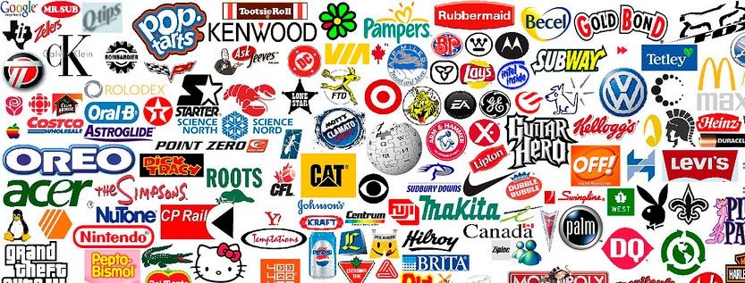
With AI spitting out logos by the thousands, a carefully designed, strategic logo is how you stand apart. It’s the difference between being seen as another option and being remembered as the brand people trust.
7 Step Checklist to Create the Perfect Logo for Your Brand
A strong logo blends strategy, creativity, and clarity. Use this step-by-step checklist to design a logo that reflects your brand and works across all social platforms.
1. Define Your Brand Identity
The first step is clarifying your brand identity. This ensures that your every design choice helps you reach your goals and meet your customers’ needs. Your logo should show what your brand stands for, what it values, and how it talks.
Establishing brand identity early ensures that your logo communicates the right message from the start.
2. Research Your Market and Competitors
A good logo design finds a balance between what is common and what stands out. By looking at your competitors, you can learn about the styles that are popular in your market and how to stand out visually without turning off your audience.

Research to answer the following:
- What logo types and colors do leading competitors use?
- Are there recurring design clichés in your industry that you should avoid?
- Are there visuals, symbols, or concepts that no one else is using?
This research will inform your creative direction and help prevent redundancy.
3. Choose the Right Logo Style
There are pros and cons to each type of logo. Choosing the right style will make sure your logo stays clear, flexible, and useful for a long time. Here are the most common types of logos and when to use them:
- Wordmark: A stylized font that spells out your full business name
- Best for: Brand names that are one of a kind (like Coca-Cola)
- Lettermark: These use short forms or initials
- Best for: Brand names that are long or hard to spell (like IBM)
- Pictorial Mark: Has a symbol or icon but no text.
- Best for: Global brands or strong visual storytelling.
- Combination mark: Has both text and a symbol or icon in it.
- Best for: Works well in both digital and print forms
- Emblem: Shows text inside a shape or badge
- Best for: branding that is traditional, institutional, or formal
Tip: Many modern brands start with a combination mark for flexibility, then shift to a simpler symbol as their recognition grows.
4. Pick Your Colors and Typography Carefully
Typography and color have a big impact on how people view your brand. Depending on your industry and emotional tone, pick two or three primary colors. Black is a symbol of opulence and power, red of vitality and urgency, green of health and development, and blue of trust and professionalism.
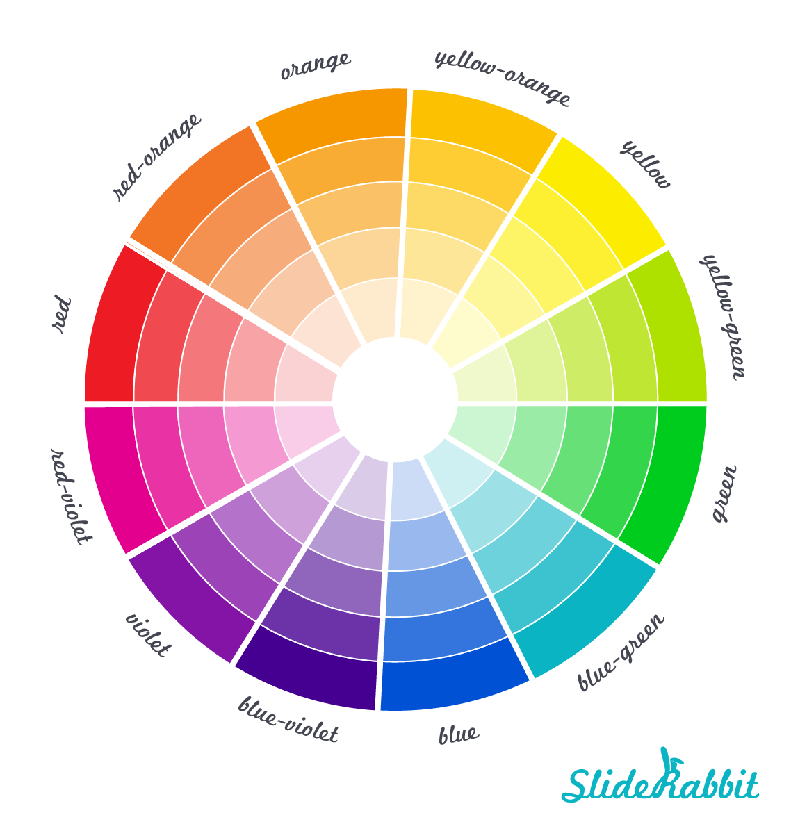
Source: SlideRabbit
The personality of your brand should also be reflected in the typography. Sans-serif fonts look modern and clean, while serif fonts look more formal and classic.
Instead of using flashy fonts that go out of style quickly, you might want to think about making your own to make your work stand out. You can use tools like Atom’s logo making tool to customize your logo. To keep things consistent, make sure your brand guidelines include the fonts and colors you use.
5. Keep It Simple and Versatile
The best logos are simple, easy to remember, and can be used in many different ways. A clean design makes it easy to use on different devices and in different places.
Design principles to follow:
- Remove unnecessary visual elements that do not contribute meaning.
- Ensure your logo works well in black and white as well as in color.
- Test your logo at small sizes (e.g., favicon, app icon) and large formats (e.g., signage).
- Use a single concept or idea as the design’s focal point.
Simplicity also increases recognizability and longevity. Complex logos may impress in presentation decks, but they often fail in real-world usage. Modern AI presentation tools can help streamline the design process and ensure your visuals stay clean, professional, and memorable.
6. Get Feedback and Refine
Get input from a variety of stakeholders after you have a few finalized logo concepts. Take that feedback as information about how your logo speaks to various audiences rather than as a command.
Ask specific questions like:
- What three words come to mind when you see this logo?
- Is the logo legible at a small size?
- Does it convey the intended brand personality?
- How does it compare to others in the industry?
Refine the design based on recurring patterns in the feedback. Avoid trying to satisfy every opinion; stay focused on clarity, cohesion, and alignment with your brand identity.
7. Prepare Final Files for Every Use Case
Making full logo files makes sure that your design works on all platforms, channels, and formats. If you don’t prepare here, your brand will be inconsistent, your files will be of poor quality, and you’ll waste time during campaigns or launches.
Organize the files into clearly named folders for easy access by marketing, developers, and external partners.
Common Mistakes to Avoid When Designing the Perfect Logo
Even well-thought-out ideas can fail if important parts are left out. Avoid making these common mistakes when you design your logo:
- Chasing Trends Instead of Timeless Design: Trendy logos may feel fresh now but they tend to look outdated within a year. To avoid this, try focusing on creating a design that lasts.
- Using Raster Instead of Vector Formats: Raster images lose quality when resized. Always use vector files to keep your logo sharp and scalable.
- Overcomplicating the Design: Too many colors, shapes, or fonts make your logo hard to remember. Aim for simplicity and clarity.
- Not testing in the real world: A logo that looks great in a mockup might not work on social media or in packaging. Try it out in all the right apps.
- Ignoring Trademark Conflicts: Always check for existing trademarks before finalizing your logo. Legal issues can force a costly rebrand.
A strong logo enhances your brand, fosters trust, and promotes expansion through all media. You lay the groundwork for a long-lasting brand identity by using this checklist and steering clear of typical blunders.
Conclusion
Making the perfect logo is a strategic and creative endeavor that, when done well, can increase the visibility of your business on all platforms. A strong logo makes it more likely that customers will recognize, remember, and trust your business.
This thorough seven-step method will help you develop a visual identity that embodies your business and engages your audience. It covers defining your identity, conducting market research, selecting the ideal format, refining your images, and producing files that are flexible.