Maintaining a consistent visual language across a digital product is a deceptive challenge. What starts as a simple need for a “home” icon quickly spirals. Suddenly, you need thousands of distinct assets that all share the exact same stroke weight, corner radius, and perspective.
Product teams face a difficult question: How do we keep a consistent visual language without dedicating a full-time designer solely to building an in-house icon set?
Icons8 answers this by positioning itself as infrastructure, not just a repository. With over 1.4 million icons and strict adherence to operating system guidelines, it functions less like a gallery and more like a utility for standardized design.
The Architecture of Consistency
Most icon sites group assets by subject matter. Icons8 prioritizes style.
The library contains over 45 visual styles, each containing thousands of icons. Some packs exceed 10,000 assets. This distinction matters for interface design. Building an iOS application requires more than a generic “settings” gear; you need one that matches Apple’s Human Interface Guidelines.
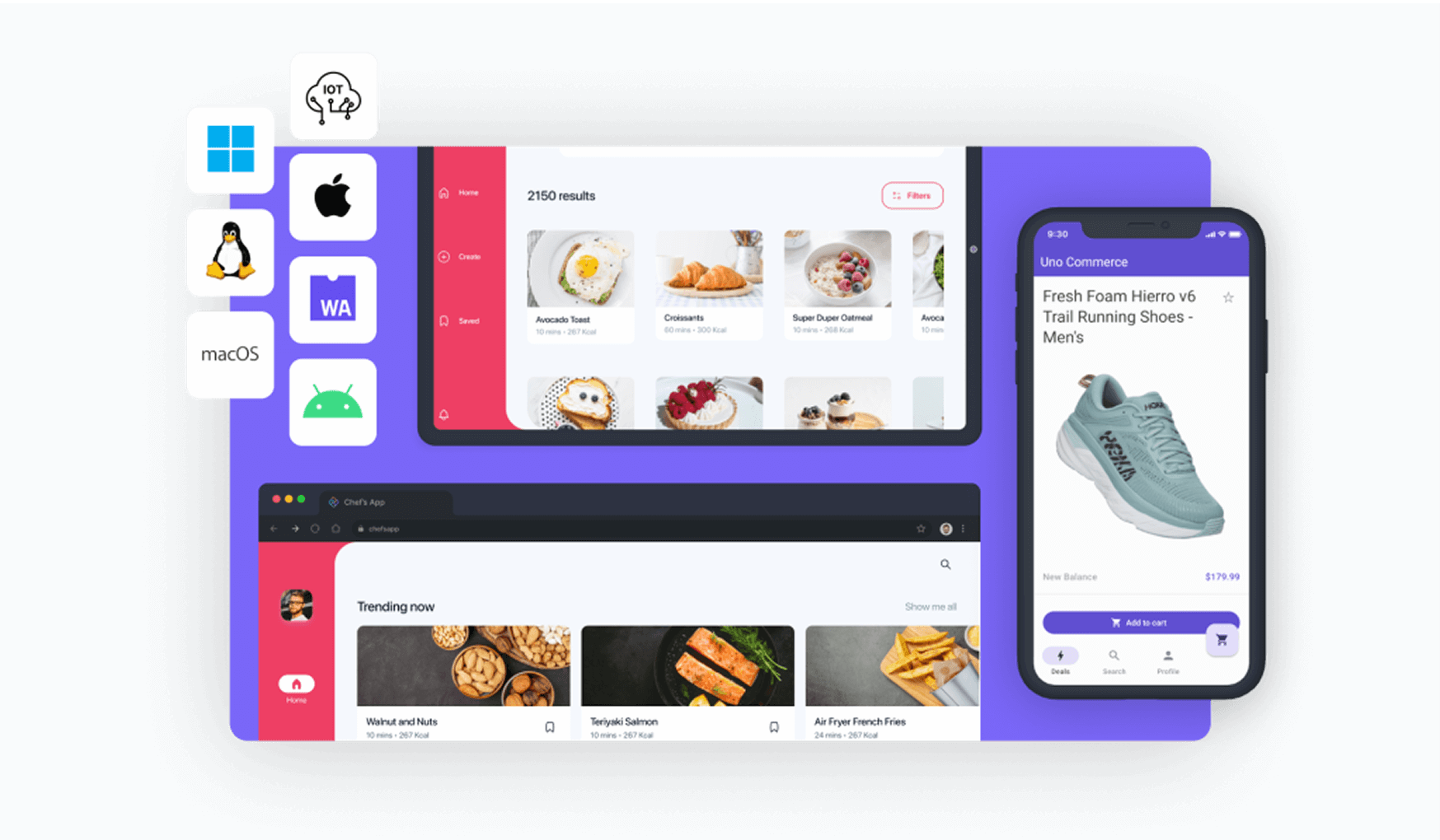
Icons8 offers specific sets for iOS 17 (in Outlined, Filled, and Glyph variants), Windows 11, and Android (Material Outlined).
Teams working across platforms gain a “write once, deploy everywhere” workflow. You can find the same metaphor-say, a shopping cart-rendered perfectly for a Windows desktop app and a native iPhone app. The two won’t look disjointed. They look native.
Scenario: The Cross-Platform UI Overhaul
Imagine a UI design team modernizing a legacy SaaS platform. The scope includes a web dashboard, an iPad companion app, and an Android utility.
Style selection comes first. The team opts for “3D Fluency” on marketing pages to add depth. For the dense data tables in the web dashboard, they stick to “Material Outlined.” Because the library is vast, they avoid the common roadblock of finding a great style only to realize it lacks niche industry icons.
Designers drop assets directly into mockups using the Figma plugin. Later, the product manager decides the Android app must strictly follow Google’s latest standards. The designers don’t redraw the assets. They simply switch the library filter to the relevant Android category and swap the instances.
The visual metaphor stays the same. The geometric execution shifts to match the OS environment.
Scenario: The Developer Implementation Cycle
Frontend engineers often dread chasing down SVG exports or dealing with inconsistent viewboxes. Icons8 offers several better integration paths.
For a marketing site, a developer might use the CDN link to embed icons directly into the HTML. This enables quick updates without redeploying the codebase. For application logic, they download the SVG.
One specific feature stands out: “Simplified SVG.” By default, Icons8 cleans up the code structure of the vector. But sometimes, a specific interactive button needs a stroke path animation on hover. The developer unchecks “Simplified SVG” to access raw, editable paths. Now they can manipulate vector nodes via CSS or JS.
Mobile onboarding flows often need more life than static images can provide. The developer grabs the Lottie JSON format for key icons. Smooth, scalable animations react to user input, polishing the first-time user experience. No motion graphics specialist required.
A Tuesday Morning in Content Marketing
A social media manager needs to create a deck for an upcoming partnership proposal. They aren’t a designer. They don’t have Figma. But the presentation needs to look professional.
They open the Icons8 web interface. The slide deck uses a dark navy background, so standard black icons vanish. They search for a “handshake” icon in the “Liquid Glass” style. Instead of downloading immediately, they open the in-browser editor.
Padding adjustments ensure the icon doesn’t touch the image container edges. Next, they need a brand asset. They search for a youtube logo for the footer. The standard red clashes with the navy theme. Using the recolor tool, they shift the logo to monochrome white.
Finally, they drag these customized assets into a “Q3 Proposal” collection and perform a bulk download. Since this is for a slide deck, vectors aren’t necessary. They grab high-resolution PNGs (up to 1600px) to ensure crisp edges on large conference room monitors.
Comparing the Ecosystem
Weighing Icons8 against common alternatives helps clarify its position in the tool stack.
In-House Systems
Building your own set offers maximum control. It also demands maximum resources. You must design, maintain, and update thousands of assets. Icons8 acts as a massive, outsourced version of this. You get the volume without the overhead, though you sacrifice “100% unique” brand ownership.
Open Source (Feather, Heroicons)
Libraries like Feather or Heroicons work well for small projects. They are free and code-friendly. But they usually cap out at 200-300 essential icons. If your app requires niche concepts-like “artificial intelligence” or “medical chart”-you will run out of options. Mixing styles breaks consistency.
Noun Project
The Noun Project offers vast diversity and unique artistic interpretations. But it aggregates work from different designers. Finding 50 icons that look like they were drawn by the same hand is difficult. Icons8 prioritizes strict uniformity, making it better suited for UI systems than illustrative flair.
Limitations
Icons8 isn’t the right solution for every context.
The “Free” Tier Reality
The free plan works for prototyping but restricts production. PNG downloads cap at 100px and require a visible link back to Icons8. If you can’t provide attribution or need vector formats (SVG) for responsive web design, the free tier falls short.
Trademark Usage
“Logos” and “Characters” categories are free, but they come with a caveat. Downloading a logo doesn’t grant the legal right to use it commercially. You are still responsible for obtaining permission from the trademark owner. Corporate compliance teams often flag this.
Generic Aesthetic
System compliance means the icons are designed to be universally applicable. Sometimes that feels “safe” or generic. If a brand relies on a disruptive, hand-drawn, or grunge aesthetic, the clean lines of the iOS and Windows packs may feel too clinical.
Practical Workflow Tips
For teams committing to Icons8, a few best practices speed up the process:
- Master the Collections: Stop downloading icons one by one. Drag everything for a project into a Collection. Bulk-recolor every asset to your brand’s primary HEX code in a single click, then export.
- Use the Request System: Missing a specific metaphor? Use the Icon Request feature. It’s community-driven; requests with enough likes go into production. This beats hacking together a composite icon yourself.
- Smart Searching: Have a rough sketch or low-res screenshot? Use “Search by Image.” The AI matches the shape and composition to existing assets in the library.
- Mac App Efficiency: macOS users should use the Pichon app. It’s generally faster than the web interface and supports drag-and-drop directly into design tools.
Icons8 bridges the gap between limited open-source packs and the high cost of custom design. By focusing on the system of iconography rather than individual images, it solves the consistency problem for teams that need to move fast without breaking their visual language.